Fairglow is the premier carbon management platform catering to the cosmetics industry, empowering companies of varying sizes to gauge and mitigate their product's environmental footprint effectively.
During my brief but impactful tenure as Lead Product Designer at Fairglow, I established UX foundations, developed a cohesive visual design system, and created wireframes and high-fidelity UI mockups for key user flows. I also designed the company logo and revamped their marketing website to align with the refreshed branding.
Fixed-term contract completed in April 2024Project overview
I closely collaborated with the team's three co-founders, who generously shared their industry insights and outlined the company's short-term and long-term design objectives. Delving into independent research, I immersed myself in the expansive realm of carbon, while also familiarizing myself with the regulatory landscape, particularly in light of recent EU legislation prompting a surge in demand for carbon reporting and reduction tools. Drawing inspiration from established products in analogous sectors, I strategized with the team on tailoring our approach for the cosmetics industry.
Working with a company in its nascent stages was a captivating experience, as I witnessed firsthand the significant impact of my contributions on product development and branding initiatives. By imparting my design methodologies to the team, and left behind a design strategy to help guide their next stages. Operating within a hyper-agile startup culture, I embraced rapid design iterations and a relentless pursuit of short-term milestones, culminating in the delivery of an initial MVP.
Remotely collaborating with an EU-based company exposed me to the dynamics of working with a globally dispersed team, necessitating adeptness in navigating diverse cultural backgrounds, communication styles, and asynchronous work schedules. Beginning with wireframes and rough concepts provided by a co-founder, I steered the project towards a comprehensive, meticulously tested interface. Although my contract concluded during the early stages of the product’s development, I departed with a profound sense of accomplishment, fueled by the belief that the designs I crafted will eventually contribute to meaningful environmental progress.
Discovery phase
During the discovery phase, I created a series of diagrams which I reviewed with the team’s stakeholders to ensure that I was aligned on the overall goals for the product. My goals were to establish a high-level user journey, platform site map, and information architecture that I could use as a backbone, before starting to dive into designing specific user flows and screens.
User journey map outlining the anticipated path users follow from discovering Fairglow to subscribing, navigating through onboarding, engaging with the product, and identifying factors influencing customer retention. Discussion points highlight key aspects contributing to successful outcomes at each stage of the journey.
A comprehensive site map delineating the application touchpoints essential for guiding users through every stage of the intended experience. This visual roadmap fostered productive discussions and unveiled crucial insights into structuring the platform's information architecture, thereby laying the groundwork for a seamless user experience.
A rough sketch that I made prior to creating the site map, to establish the IA of the platform.
Product portfolio
The product portfolio serves as the central hub where users can effortlessly explore the carbon impact of their products presented in a user-friendly table format. Each column thoughtfully presents essential information, meticulously arranged to cater to the specific insights sought by our target users.
Several key states of the product portfolio page: The initial table view, the “display inventory and totals” view, which adds additional columns to provide information about product quantities, the impact category switcher, and the basic search functionality.
Detailed annotations I provided for the impact category selector, showing the UI for each state of the component. This switcher allows users to toggle between different impact categories, replacing the default “Climate change” option with others, such as categories relating to water, human health, and ozone depletion.
Sketches I made while brainstorming the product portfolio section. The sketch on the left shows how I established the main layout for the page and table; the sketch on the right shows some ideas I explored for the addition of the “Gauge” column.
Product detail page
Accessed via the product portfolio, this page provides a comprehensive exploration of individual products, showcasing key metrics and allowing users to delve into every dimension of the equation that contributes to the total impact scores.
View of the product portfolio page, showing the primary content captured in the upper portion of the content area, allowing the users to dig deeper into each dimension as they scroll down the page.
Product export option dialogue modal.
Expanded view of the Ingredients section, showing the first level of detail.
Expanded view of the Packaging section, showing the UI pattern for the popover window that expands for more information related to any value shown.
Expanded view of the Distribution section, showing the most atomic level of detail, in which every leg of the transportation journey is captured, with carbon impact associated with each.
Expanded view of the Use section, showing data relevant to carbon emissions created by using the product.
Expanded view of the End of Life section, showing data reflecting the impact caused by disposing each component of the product’s packaging and substance drainage.
Sketches I made to establish concepts and quickly iterate on ideas, prior to building out wireframes for the screens.
Adding products
This screen flow enables users to upload new products, calculating their environmental impact and adding them directly to their portfolio.
Basic form for the manual upload option, where users can input required information for each product, one at a time.
Annotations I created to show the interaction and visual details for each state of each field type, toggle and button.
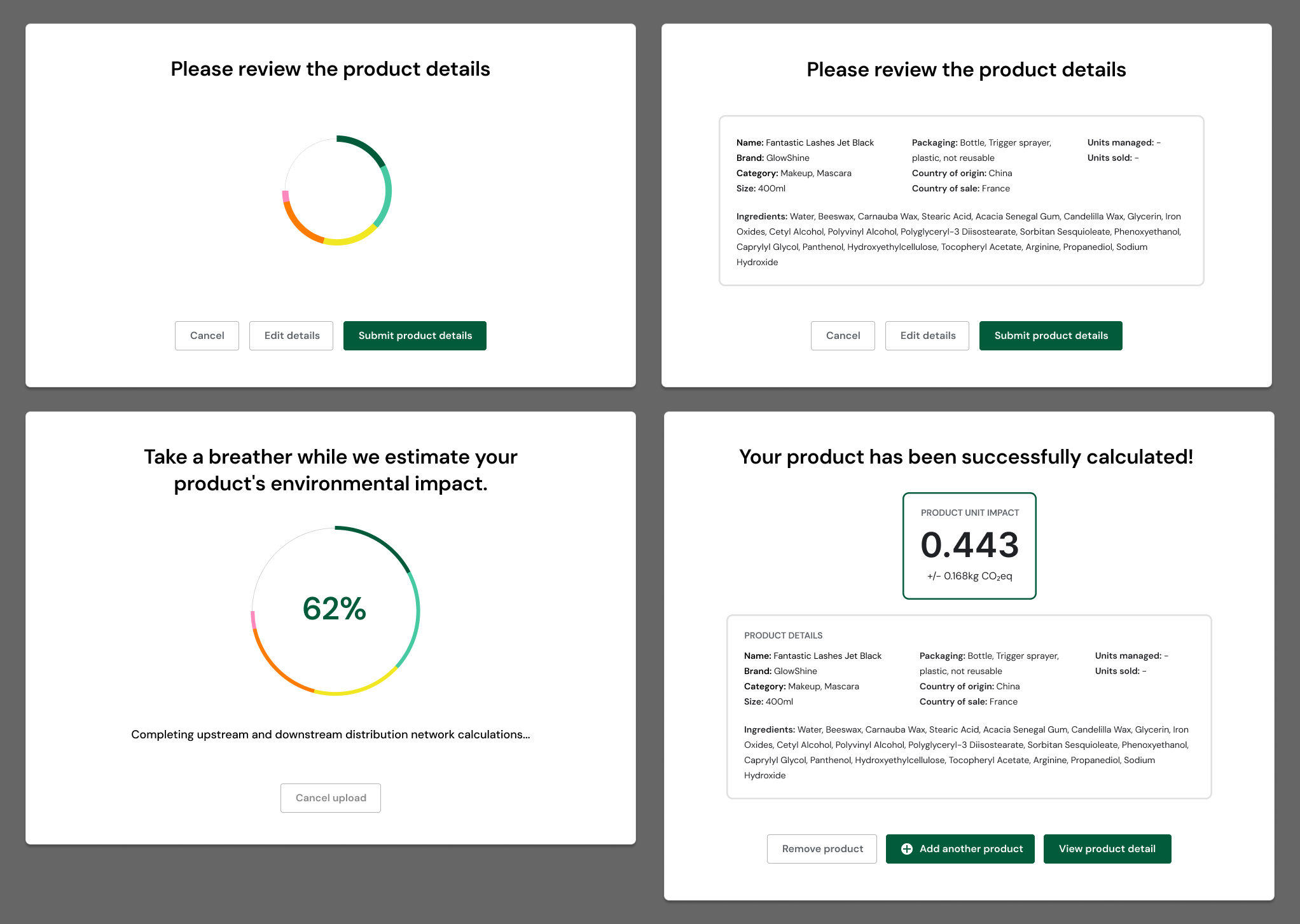
Interstitial screen with the stages of the experience between when the user submits the form, and when it is added to their product portfolio.
Diagrams I put together to storyboard out the loading animation, as well as to articulate to the engineering team my plan for how to implement it. I created an animation in After Effects of this progress loading wheel, which can be easily implemented as an SVG animation.
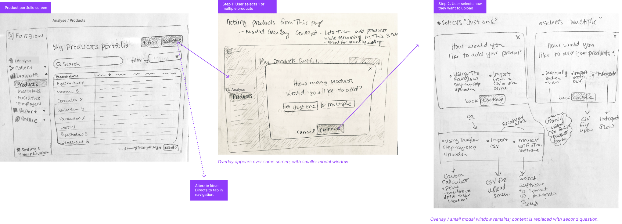
A series of quick low-fidelity sketches that I created so that I could establish an idea I had around the product-adding flow, and run it by the project stakeholders for a quick gut check.
Dashboard page
The dashboard page empowers users to customize their own dashboard views, selecting specific chart types to reflect the data points most pertinent to their team’s goals.
Overview tab, showing an array of top-level stats, tables and charts.
Emissions by scope tab, showing a breakdown of the data into scope 1, 2, and 3 GHG emissions.
Sketch I made early-on in the project for the “Home” screen, which inspired the layout of the dashboard overview page.
Navigation
The left side-bar navigation system enables effortless exploration of the platform, granting users swift access to desired actions or views.
Sticker sheet I created for the navigation, showing each state, and providing final UI components that are ready for implementation. These components are part of the larger platform-wide component library system that I created.
Authentication experience
I crafted an intuitive authentication experience designed to cater to both new customers creating accounts and returning users signing in. The interface features a seamless branching system, presenting users with the option to authenticate either via Google or through email, ensuring a clean and straightforward process.
The login screen layout, shown at two of the provided breakpoints.
Mockups I created to illustrate the various states of the sign-in experience, establishing the functionality as well as providing final ready-to-build high-fidelity components.
Branding
At its core, the logo features a modified pie chart, symbolizing the data-driven nature of our endeavors. This geometric form, intertwined with organic linework reminiscent of leaves and tree branches, reflects Fairglow’s commitment to nature and sustainability. The overall composition and color palette evokes the tranquility of a peaceful sunset or sunrise, infusing the brand with an aura of optimism and serenity.
I worked a few “easter eggs” into the design as well: The logo's shape subtly echoes that of a makeup compact case, with each colored division representing a unique hue. Lastly, the subtle incorporation of an eye motif with mascara-laden eyelashes nods to our focus on personal care and beauty, adding a touch of elegance and sophistication to our visual identity.
The final identity mark that I designed, which is currently featured on all of Fairglows’ product, web, and marketing materials.
The final identity mark, including text. I selected the geometric sans serif typeface, Bauhaus Slim Display by Mojomox, to give it a modern yet approachable feel.


