Change the Game is an interactive web experience that tells the data-driven story of women in the mobile gaming industry.
I conceptualized and executed artwork for the illustrated worlds, led the site's UI/UX design, and worked closely with our small design team on content strategy, visual direction, and site narrative.
Created and launched in 2017Project overview
Our team of designers and developers, dedicated to creating projects for Google Play partnered with gaming intelligence provider Newzoo on a quantitative study aimed at understanding the experiences and perceptions of female players. We engaged with with dozens of game makers, critics, players and academics to contextualize our findings.
On the website, visitors navigate by horizontally scrolling through five uniquely themed worlds, and have the option to play the three mini games embedded throughout. The website’s structure draws inspiration from the structure of retro platformer video games, with nods to trends in current mobile gaming. By making the experience feel like a game itself, users can engage with the message and internalize the themes in a deeper manner. There is still much to discover about inclusion within the mobile gaming industry, and I am optimistic that this approach to sharing these initial findings will serve as a catalyst for an essential dialogue.
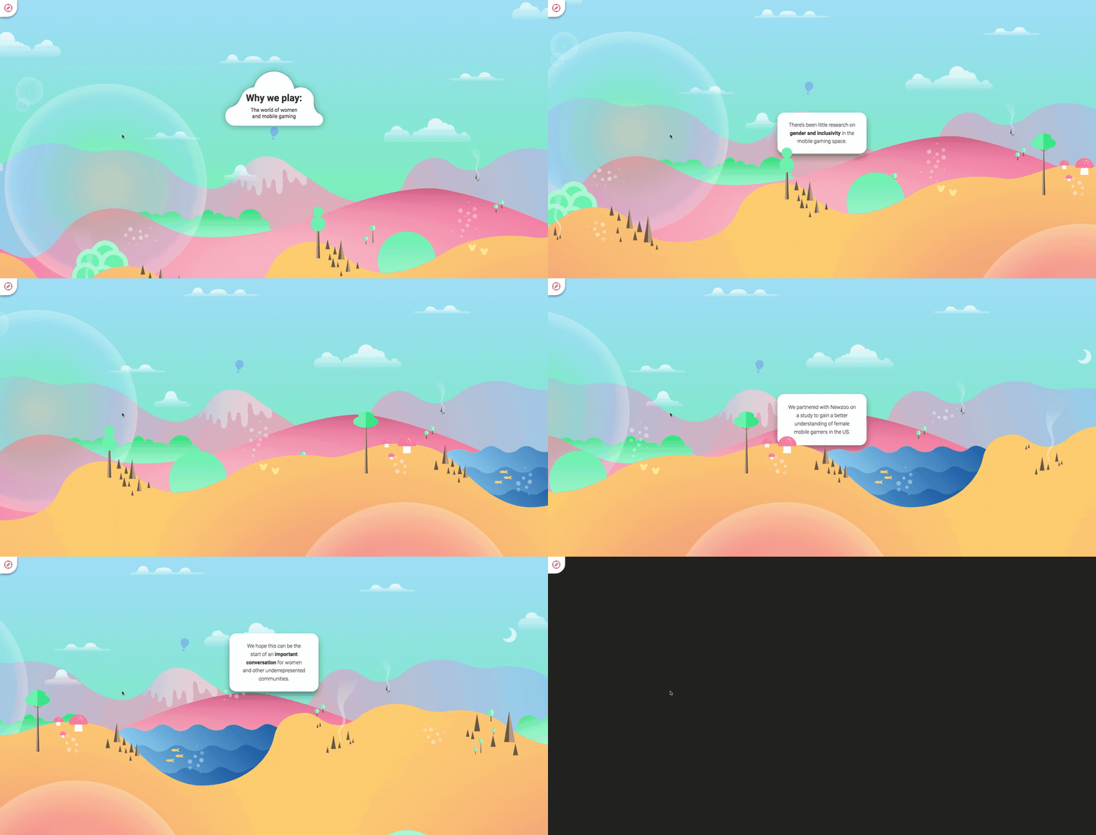
Opening scene from the prologue, the first of five chapters.
A clip from the third level, with an underground cave theme.
Implementation strategy
I collaborated closely with our development team to devise an innovative strategy for the website's construction. Our approach involved crafting a single, expansive mosaic map that seamlessly integrated all five levels into one unified plane. We incorporated a persistent "navatar" character which was linked to the user's scroll position, ensuring the viewport's movement tracked the map's progression, consistently centering the focal point for the user. This technical solution allowed us to simulate an engaging multi-level video game experience, where users would witness their character transitioning between different worlds as they scrolled. The highly interactive design concept would keep users engaged as they consumed the informative content.
At the heart of the experience stands the "navatar," our constant companion—a character seamlessly synchronized with the user's scroll position, guiding them on a journey through the various levels.
Mosaic map divided into two rows, which I created and shared with our development team.
Conveying the design details
In addition, I supplied a comprehensive set of detailed annotations, outlining every required movement for the navatar, including jumps, character rotations, and pauses. They also showed storyboard keyframes for any animated elements. Additionally, these annotations precisely dictated the ideal viewport position at all times, ensuring not only the navatar but also all relevant text and statistical content remained perfectly centered for an optimal user experience.
Excerpts from various parts of the experience, highlighting instructions for building out detailed motion components.
Process sketches
Sketches that I made so that I could quickly iterate on concepts, to share with the internal team before moving into higher fidelity design mocks. These sketches helped me establish not only the overall site map, layout, and navigation, but the individual storyboards for the scenes.
Left: Site map, showing the basic format of navigating through the worlds in a linear order. Right: Navigation, showing how the users would process through the levels by utilizing the nav links to jump to specific areas in the narrative.
Sketches outlining the instructional UI, guiding users on site navigation. Emphasizing usability and accessibility: The inclusion of 'Scroll to begin' text ensured users understood navigation via scrolling, while left/right arrow instructions provided keyboard navigation options, enhancing accessibility for mouse-free users.
Forrest level: Storyboard sketches I made to establish how various stats of the report would be visualized. Dotted lines indicate the navatar’s path, outlining where the navatar will travel as the user scrolls.
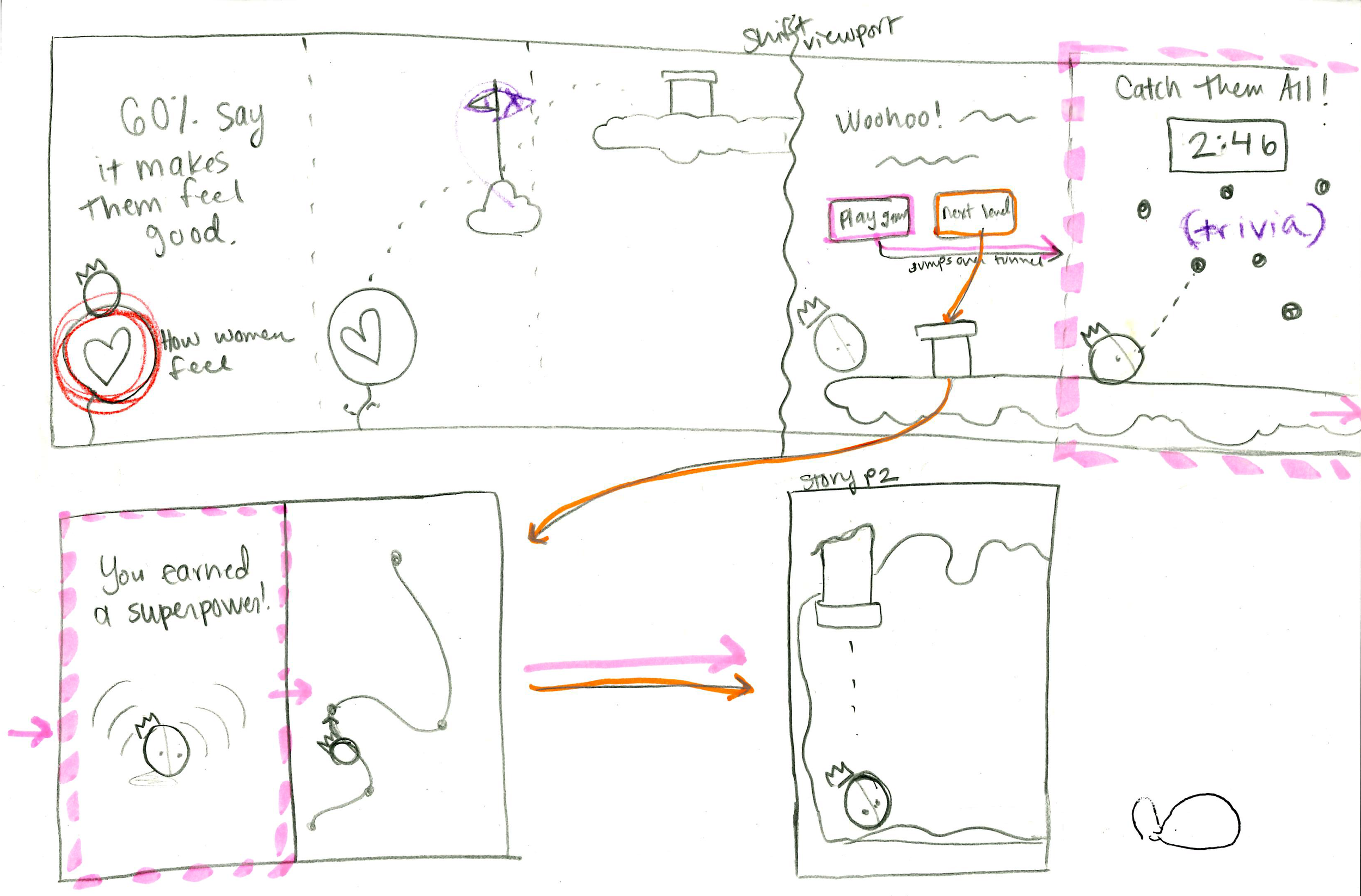
Sketches I made to outline the user flow for the interactive mini-games, which were featured at the end of three of the levels. I explored the concept of having the navatar travel through a tunnel-shaped portal, reminiscent of Super Mario.
Cave level: Sketches I made to map out the storyboards for the level. Some of these concepts didn’t make it into the final (such as the stack of coins and the trap door). However, these served to open up productive discussions where my teammates and I brainstormed about the most effective ways to showcase the report’s findings.
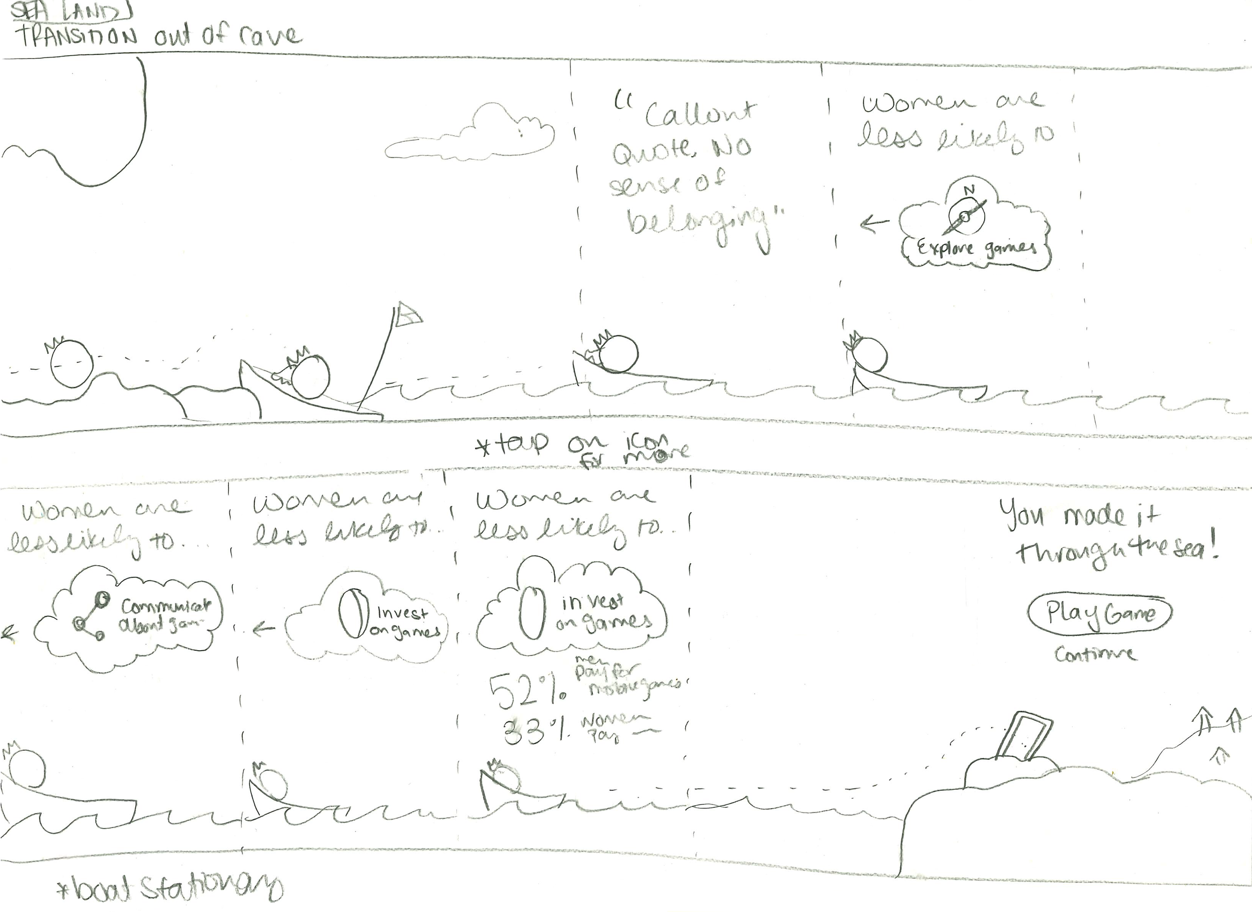
Left: Transition scene between levels. Right: Storyboard sketches for the Sea level.


